컨테이너에 적용하는 속성
1) flex vs inline-flex
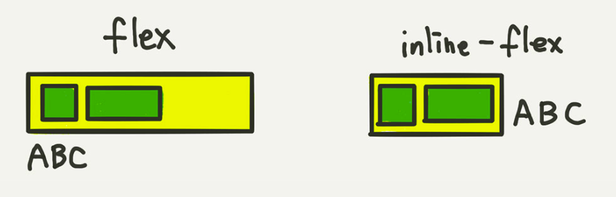
.container {
    display: flex;  //한줄을 차지
    /* display: inline-flex; */  //인라인 속성처럼 플렉스아이템의 너비의 합까지만 차지
}
2)) flex-direction - 배치방향설정
.container {
        flex-direction: row;  가로(행 방향) 왼->오
        // flex-direction: column;   세로(열 방향)    위->아래
        // flex-direction: row-reverse;   반대 가로 왼<-오
        // flex-direction: column-reverse;    반대 세로  아래 -> 위
    }
3) flex-wrap -줄넘김 처리
.container {
        flex-wrap: nowrap;  //기본값 줄넘김x
        // flex-wrap: wrap;
        // flex-wrap: wrap-reverse;
    }
4) flex-flow
.container {
        flex-flow: row wrap;
        // 아래의 두 줄을 줄여 쓴 것
        // flex-direction: row;
        // flex-wrap: wrap;
    }
5) 정렬
“justify”는 메인축(오뎅꼬치) 방향으로 정렬
“align”은 수직축(오뎅을 뜯어내는) 방향으로 정렬
5-1)justify-content 메인축 방향 정렬
.container {
justify-content: flex-start; 앞에서 뒤쪽으로
// justify-content: flex-end; 뒤에서 앞쪽으로
// justify-content: center; 중간에
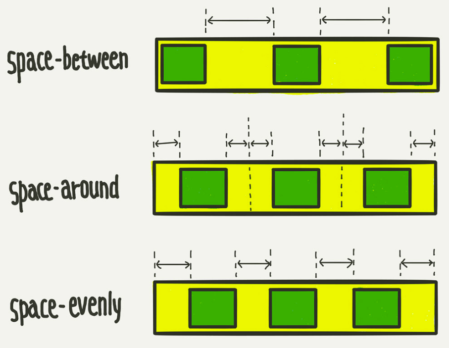
// justify-content: space-between; 아이템들 “사이(between)”에 균일한 간격
// justify-content: space-around; 아이템들의 “둘레(around)”에 균일한 간격
// justify-content: space-evenly;
}
5-2) align-items 수직축 방향 정렬
.container {
                align-items: stretch;   // 아이템들이 수직축 방향으로 끝까지 쭈욱 늘어납니다.
            //    align-items: flex-start;
            //    align-items: flex-end;
            //    align-items: center;
            //    align-items: baseline;  아이템들을 텍스트 베이스라인 기준으로 정렬
            }
출처: https://studiomeal.com/archives/197
반응형
'개발 공부 > 웹개발' 카테고리의 다른 글
| SASS(Syntactically Awesome StyleSheet) 개념 + Sass와 CSSS 차이 (0) | 2021.10.29 |
|---|---|
| [CSS] Flex 아이템에 적용하는 속성들(1) (0) | 2021.08.03 |
| [CSS] grid 개념정리(1) (0) | 2021.07.27 |
| 오류 해결 - Warning: Can't perform a React state update on an unmounted component. (0) | 2021.07.19 |
| 동기(Synchronous)vs비동기(Asynchronous), block과 non-block 개념정리 (0) | 2021.06.24 |


댓글